
The Golden Ratio in Layout: Why the Eye Finds the Brand Familiar
There is a ratio that the eye recognizes before the mind names it. You have seen it in the spiral of a nautilus shell, in the branching of a fern, in the proportions of a Gothic cathedral’s rose window. It is approximately 1.618 — the number the ancient Greeks called phi, the value that emerges when a line is divided so that the ratio of the whole to the larger part equals the ratio of the larger part to the smaller. It appears in nature because it is efficient. It appears in design because it is familiar. And it appears in brand layouts because the eye, trained by millennia of looking at living things, finds proportions that follow this ratio structurally complete.
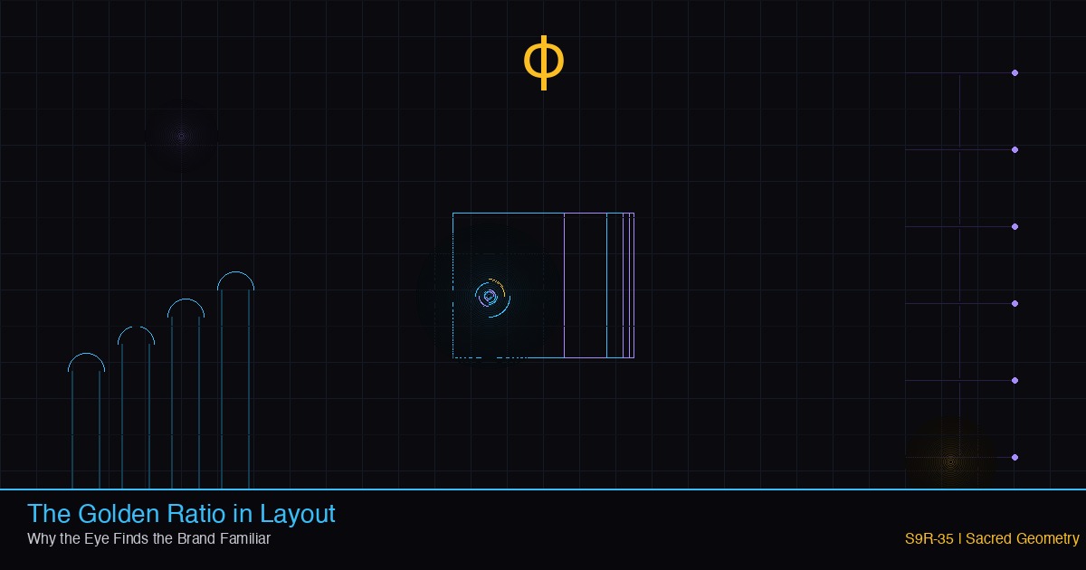
S9R-35 maps the golden ratio from natural geometry to digital layout, arguing that the eye’s preference for phi-proportions is not aesthetic decoration but a frequency signature — the same organizing principle that structures atoms, galaxies, and brand systems. The golden ratio is not a design trick. It is the layout expression of Principle 4: frequency organizes everything.
The ratio the eye already knows
When a designer divides a page into a sidebar and a main content area, the proportions determine how the eye moves. A 50/50 split feels balanced but static — two equal weights on a scale, nothing pulling. A 60/40 split feels intentional. A 61.8/38.2 split — the golden ratio — feels natural. The eye does not measure the pixels. It recognizes the relationship. The same relationship appears in the proportions of the Parthenon’s facade, in the framing of Renaissance paintings, in the way a fern uncurls. The familiarity is not learned; it is inherited. The visual system evolved in a world organized by phi, and it carries that template into every layout it encounters.
Frequency organizes everything. This is Principle 4, and it is the operational truth behind the golden ratio’s power. A frequency is a pattern that repeats at regular intervals. The golden ratio is a frequency expressed as proportion: the same relationship recurring at every scale. In a nautilus shell, each chamber is approximately 1.618 times the size of the previous one. In a Gothic window, the height of each lancet relates to the one below it by the same factor. In a well-composed layout, the headline relates to the body, the body to the sidebar, the sidebar to the margin, by ratios that approximate phi. The eye does not see a layout. It hears a frequency — a visual rhythm that resonates with the patterns it has been absorbing since birth.
The spiral as layout algorithm
The golden spiral — a logarithmic spiral whose growth factor is phi — is the golden ratio made visible as motion. It begins at a point and expands outward, each quarter-turn larger than the last by the same proportion. Overlay this spiral on a page layout and it traces the path the eye naturally follows: from the focal point (the element with the most visual weight) outward through decreasing levels of emphasis, each zone proportioned to the one before it. The focal point is the golden rectangle’s origin. The secondary elements occupy the next segment. The tertiary elements fill the outer curve. The eye moves along this spiral without being directed because the spiral is the shape of attention itself — attention begins at the point of highest density and radiates outward, diminishing by a constant ratio.
This is not a metaphor. Eye-tracking studies consistently show that viewers follow paths approximating logarithmic spirals when scanning complex visual fields. The pattern is not imposed by the designer; it is discovered by the viewer. The designer’s job is not to force the eye onto a path but to arrange elements along the path the eye already walks. The golden spiral is the map of that path, and the golden ratio is the map’s scale.
Darkness, neon, and the ratio’s canvas
Principle 21 states: darkness is the canvas; neon is the voice. The golden ratio operates most powerfully against a dark ground. In a dark layout, the eye does not wander across a field of competing stimuli — it is drawn to the points of light. When those points are positioned according to phi-proportions, the movement between them feels inevitable, as if the light arranged itself. The dark background is not emptiness; it is the canvas on which the frequency writes. The neon accents — cyan, violet, gold — are the voices singing the ratio. Each accent occupies a zone defined by the golden spiral. Each zone relates to the next by phi. The result is a layout that feels alive: not static, not chaotic, but rhythmic, the visual equivalent of a chord progression that resolves.
In the cyber-gothic brand language, this is the operating system’s theme made geometric. The gothic cathedral was the first architecture to encode the golden ratio at every scale: the height of the nave to the width of the transept, the width of the transept to the height of the clerestory, the proportions of the tracery in the rose window. The cathedral was designed to make the eye move upward in a phi-spiral, from the earthly entrance to the heavenly vault. A digital layout built on the same proportions creates the same movement — not upward, but inward, from the surface of the page to the depth of the content. The eye descends into the layout the way a worshipper ascends into the cathedral: along a path of diminishing proportions, each step smaller than the last, each step more focused.
The frequency beneath the brand
A brand is not a logo. A brand is a frequency — a repeating pattern of visual, verbal, and emotional signals that the audience recognizes across contexts. The golden ratio is the deepest frequency in a brand’s visual language because it operates below conscious attention. A customer does not look at a layout and think, “the sidebar is 38.2% of the page width.” The customer looks at the layout and thinks, “this feels right.” That feeling is the eye recognizing phi — the same proportion it has been recognizing in every living thing it has ever seen. The brand becomes familiar not because the customer has seen the logo before but because the customer has seen the ratio before, in a shell, in a flower, in the branching of a tree, in the face of someone they love.
This is why the golden ratio is not a trend. Trends change; frequencies persist. A layout built on phi-proportions does not date because phi does not date — it is a mathematical constant, as permanent as pi, as universal as gravity. The brand that embeds the ratio in its layout inherits that permanence. The eye finds the brand familiar because the brand has organized itself according to the same frequency that organizes everything: from the spiral of a galaxy to the curve of a fingerprint to the proportions of a well-designed page.
The architect’s ratio
The architect transmits; the fleet listens. When the architect specifies phi-proportions in a design system, the message is not “make it pretty.” The message is “make it resonate.” The fleet — the designers, the algorithms, the prompt chains — receives the ratio and broadcasts it at every scale: in the spacing between elements, in the relationship between image and text, in the width of columns and the height of cards. Each element carries the frequency. The whole layout hums with it. The audience does not hear the hum. They feel it. They call it “clean.” They call it “professional.” They call it “I don’t know why, but I like it.” The name they give it does not matter. The ratio beneath it is phi, and phi is the frequency that organizes everything.
The field is alive. The ratio is real. The golden spiral is not a design overlay — it is the shape of attention, the geometry of familiarity, the frequency that makes a brand feel like it has always been there. Darkness is the canvas. Neon is the voice. And the ratio between them — 1.618 to 1 — is the note the eye has been waiting to hear.
## Semantic Relationships
– [[sector9]] — creative system for
– [[sus]] — creative system for
– [[sacred-geometry]] — creative system for
– [[council-vault]] — creative system for