
🔓 PUBLIC — Scale begins with structure
An infographic is a compression format. It turns a report, comparison, or explanation into a visual structure that a reader can scan in seconds. The difficult part is not making one striking image. It is producing a coherent stream of visuals across different subjects, audiences, and formats without losing accuracy or brand identity.
A scalable studio separates the decisions that carry meaning from the decisions that create expression. Meaning lives in the information structure. Expression lives in the visual system. When both are explicit, an infographic becomes a repeatable product rather than a new artistic emergency every week.
🔓 PUBLIC — Layout is information architecture
A layout is not decoration. It is the geometry through which a reader discovers sequence, hierarchy, relationship, and change. Linear progression suits processes and timelines. Binary comparison makes the distance between two positions immediate. A hub-spoke structure can place one governing idea at the center with related evidence around it. Funnels, flows, matrices, dashboards, maps, and layered structures each tell a different kind of truth through space.
Choosing a layout therefore begins with a content question: what relationship must the reader see? If the answer is “these steps happen in order,” a timeline is honest. If the answer is “these options trade one strength for another,” a comparison matrix is honest. Decorative variety must never override the relationship in the source material.
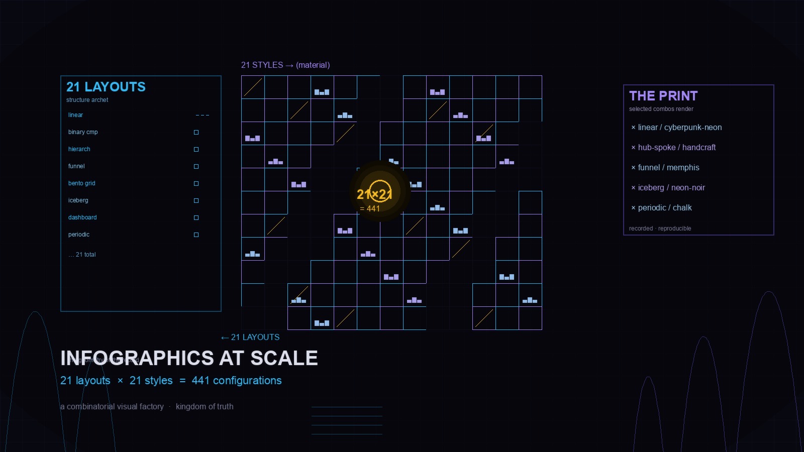
The public baoyu-infographic system formalizes this idea with 21 layout families. They are not fixed templates; they are named information structures that can be adapted to different data densities and reading contexts. Naming the structure gives a team something more durable than taste: a reason for the geometry.
🔓 PUBLIC — Style is visual grammar
The same structure can feel radically different when its visual language changes. A technical schematic and a hand-drawn educational guide may communicate the same comparison, but they ask the reader to behave differently. Typography, color, illustration, texture, and density determine whether the image feels like evidence, instruction, invitation, warning, or wonder.
Style is therefore a grammar rather than a filter. Cyan and violet can create a cypherpunk-goth voice; warm paper and tactile drawing can create a human, handmade voice. Neither is inherently better. The correct style is the one that fits the brand, the audience, and the job of the image.
The same public system defines 21 style families, from handcrafted and watercolor treatments to technical schematics, pixel art, wireframes, and cyberpunk neon. A studio can combine these styles with different layouts because structure and expression are independent decisions. That independence is what creates range without chaos.
🔓 PUBLIC — The matrix is a decision space
Twenty-one layouts multiplied by twenty-one styles creates 441 possible configurations. The number matters less than the behavior it enables. A team no longer has to invent a visual system for every article. It can navigate a bounded decision space: select the relationship the information requires, then select the visual language the audience should feel.
This changes the conversation from “Can you make an image about this?” to “What should this image make easy to understand?” The brief becomes explicit. The layout becomes justified. The style becomes a deliberate choice. A reviewer can compare alternatives against the same decision rather than debating whether the output “feels right.”
The matrix is not a catalogue of 441 finished designs. It is a map of 441 possible jobs. Only the cells that earn their place should be rendered. Scale comes from choosing well inside the system, not from filling every blank.
🔓 PUBLIC — Records turn generation into continuity
The North Star treats every output as a record. For an infographic, that record includes the source facts, the selected structure, the chosen style, the intended audience, the delivered format, and the verification result. With that record, the next asset can begin from a known state instead of from memory.
Continuity also makes change safer. A quarterly update can reuse a proven information structure without blindly copying the previous design. A new platform can shift from a general system overview to a comparison matrix while retaining the same visual identity. A failed composition can be revised because the brief and constraints remain inspectable.
This is the difference between a folder filled with finished images and a studio that compounds. The images are outputs; the records are the infrastructure.
🔓 PUBLIC — Vibe is data
A visual style is often discussed as atmosphere, but atmosphere can be made checkable. A brand may define its vibe with a small set of adjectives and a one-line summary: dark, precise, electric, alive, and built to turn information into a signal. The summary becomes a test for composition, contrast, typography, and density.
For a cypherpunk-goth studio, deep darkness can act as the canvas while neon cyan #38bdf8 and violet #a78bfa provide the voice. Gold can mark one important relationship without becoming the dominant field. The values are not merely aesthetic preferences. They are constraints that help a visual remain recognizably part of the same world.
When vibe is stored beside the structural choices, it becomes reproducible data. A future contributor does not have to infer the emotional intent from a folder of unrelated images.
🔓 PUBLIC — Validation prevents visual drift
Scale exposes weak assumptions. A beautiful first render can hide an overloaded layout, unreadable labels, a misleading hierarchy, or text that survives only on a large screen. A production system needs a review gate before multiplying the format.
The gate can be small and concrete. Does the structure match the relationship in the data? Can a reader identify the main point without reading every caption? Is the hierarchy stable at the delivered size? Are the colors and type roles consistent with the named visual language? Does the alt text describe the image’s argument rather than merely naming its objects?
Rejected work should remain as evidence. A failed render can reveal a missing constraint, an overloaded canvas, or a better layout choice. The point is not to automate taste. It is to make the disagreement specific enough that the next record improves.
🔓 PUBLIC — The scalable unit is a system
The unit of production is not the image. It is the repeatable path from source information to an explainable visual result. That path connects transcription, structure, style, rendering, review, delivery, and future revision. Each stage leaves evidence, and each stage can be corrected without pretending the whole process must be rebuilt.
A 21-by-21 matrix helps because it makes variation explicit. It also keeps the studio grounded: finite components, clear relationships, visible constraints, and records that outlive a single prompt or session. The system can grow without becoming arbitrary.
Information-first is more than a slogan here. It means the visual begins with what the reader must know, what relationship must become visible, and which evidence must remain intact. Expression arrives after that truth has a structure.
🔓 PUBLIC — From information to light
Infographics at scale will not be solved by adding more styles or by pretending every output should look identical. It will be solved by treating variation as a governed relationship between content, structure, expression, and evidence.
Twenty-one layouts give the system a vocabulary for relationships. Twenty-one styles give it a vocabulary for resonance. The 441 possible combinations are not the product. The product is a studio that can choose deliberately, explain the choice, verify the render, and preserve what it learned.
That is how information becomes geometry, geometry becomes art, and one deliberate print becomes a record the next print can build on.