
# The Studio’s Visual Language: Cypherpunk Goth, Systematized
> **Draft — S9.8 · series: CONTENT-ROADMAP-99 S9 (Media & Creative Pipeline) · status: DRAFT · grounding: clipping-agent · comfyui · creative-pipeline · ai-animation-factory · tags: cypherpunk-goth, visual-language, brand-system, creative-pipeline, media-generation, image-generation, comfyui, ai-agents, digital-architecture, sovereign-infrastructure, local-first, ai-automation, creative-ai, design-systems, brand-consistency, prompt-engineering, visual-identity, dark-aesthetic, neon-cyan, neon-violet, web-4.0, lucid-studio**
—
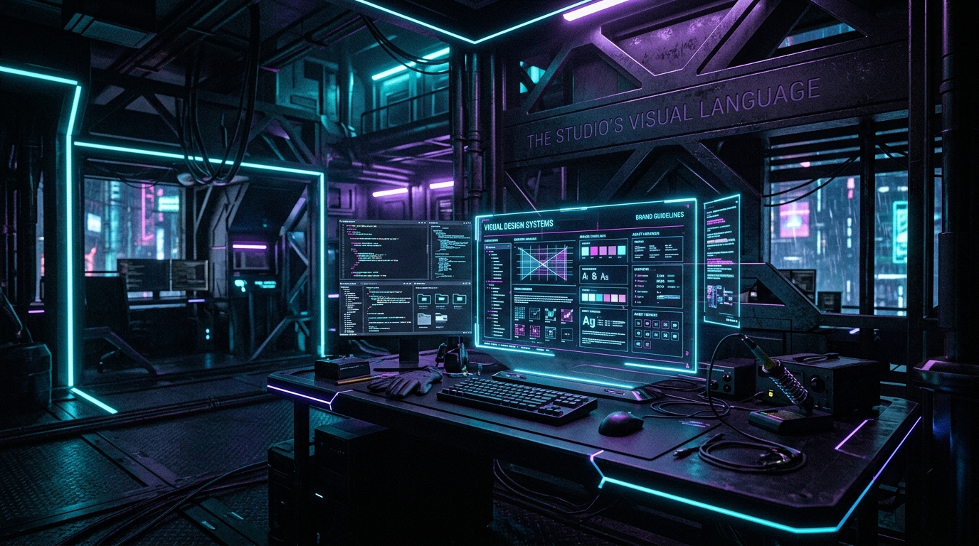
A visual language is not a filter. It is not a color grade applied in post. It is a system — a set of rules that constrain, repeat, and compose so that every output from the pipeline looks like it belongs to the same world, whether it was rendered by ComfyUI on a laptop, generated by an AI animation factory, or photographed by a human with a camera. The Lucid Studio visual language is cypherpunk goth: dark surfaces, neon accents in cyan and violet, high contrast, architectural geometry, and a grain that makes everything feel like it was captured on a sensor that was never meant to exist. This article is about how that language is codified — not as a mood board, but as a production system.
## The problem with vibes
Most creative operations run on vibes. A designer picks colors that feel right. A photographer adjusts the grade until it looks good. An AI generates an image from a prompt that includes “cyberpunk” and “dark” and hopes for the best. The result is inconsistency. One image is heavy on blue. Another leans purple. A third has warm tones that break the visual field entirely. When the pipeline produces 50 images a day, vibes do not scale.
The Lucid Studio approach is different. The visual language is defined as a constraint system — a set of hard rules that every output must satisfy before it leaves the pipeline. These rules are not suggestions. They are enforced at the prompt level (in the ComfyUI workflow), at the evaluation level (in the output scoring), and at the publishing level (in the WordPress import). The system does not ask “does this look good?” It asks “does this conform?” Conformity is the floor. Artistry happens within the constraints.
## The five constraints
The cypherpunk goth language is built from five constraints that compose together.
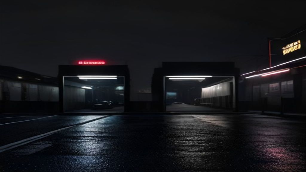
**Constraint 1: Dark base.** Every image starts from a dark surface. Not black — dark. The difference matters. Pure black (#000000) kills depth. The base is a near-black that retains tonal range: #0a0a0f to #1a1a2e. This gives the image room to breathe while maintaining the darkness that defines the aesthetic. In ComfyUI, this is enforced by the checkpoint selection (dark-trained models) and the negative prompt (which excludes bright backgrounds, white space, and daylight scenes).
**Constraint 2: Neon accent duopoly.** Two accent colors dominate: cyan (#00f0ff) and violet (#8b5cf6). These are not arbitrary. Cyan sits at the cool end of the spectrum, evoking digital interfaces and terminal screens. Violet sits at the warm end of the cool spectrum, evoking mystery and the uncanny. Together, they create a visual tension that is the signature of the language. The ratio is not 50/50 — it is typically 70/30, with one accent dominant and the other as a highlight. The dominant accent is chosen per output based on the subject: architecture and interfaces lean cyan; people and organic forms lean violet.
**Constraint 3: High contrast.** The gap between the darkest darks and the brightest brights is maximized. Midtones are compressed. This creates the “pop” that makes cypherpunk visuals distinctive — neon lines cutting through darkness, not blended into it. In ComfyUI, this is controlled by the CFG scale (higher = more contrast adherence) and the post-processing pipeline (levels adjustment that clips the histogram at both ends).
**Constraint 4: Architectural geometry.** Composition favors strong vertical and horizontal lines. Grids, frames, structural elements. The aesthetic is built environments, not open landscapes. When the subject is a person, they are framed by architecture — doorways, windows, structural beams. When the subject is an object, it sits on a surface with clean edges. The camera angle is typically eye-level or slightly below, giving the subject a sense of presence.
**Constraint 5: Sensor grain.** A fine grain overlay is applied to every output. Not the heavy film grain of vintage photography — a digital grain that mimics the noise pattern of a sensor pushed to its limits. This grain does two things: it unifies the visual field (different renders get the same grain texture, making them feel like they came from the same camera), and it adds a tactile quality that pure digital renders lack. The grain is applied in post-processing, not in the AI model, so it is consistent across all generation methods.
## From constraints to prompts
The constraint system is not a style guide that designers read. It is a prompt template that agents execute. The ComfyUI workflow includes a “brand layer” node that injects the five constraints into every prompt before it reaches the model. The node appends constraint keywords, adjusts negative prompts, and sets parameter ranges (CFG, steps, sampler) that enforce the visual language mechanically.
This is the difference between a mood board and a system. A mood board says “make it look like this.” A prompt template says “these are the exact parameters, negative prompts, and model selections that produce this look — and any deviation is rejected.” The creative-pipeline skill orchestrates this: it takes a content brief, selects the appropriate workflow template, injects the brand layer, renders the output, and evaluates the result against the constraint checklist before promoting it to the next stage.
The clipping-agent feeds the pipeline from Telegram — a user sends a reference image or a video clip, the agent extracts frames, and the best frames enter the ComfyUI batch with the brand layer applied. The ai-animation-factory extends this to motion: keyframes are rendered with the same constraint system, ensuring that animated content carries the same visual language as static images.
## The evaluation gate
Rendering an image that conforms to the constraints is necessary but not sufficient. The pipeline includes an evaluation gate that scores every output against the five constraints. The scoring is automated: a vision model analyzes the rendered image and checks for dark base compliance (histogram analysis), accent color presence (color space detection), contrast ratio (luminance range), compositional geometry (edge detection), and grain application (texture analysis).
Images that score below the threshold are re-rendered with adjusted parameters. Images that pass are promoted to the publish stage. This is not a human gate — it is an agent gate. The system evaluates its own output and makes decisions without human intervention. The human sets the constraints. The system enforces them.
The evaluation gate is what makes the visual language systematized rather than aspirational. Aspiration says “we should look like this.” Systematization says “we do look like this, and here is the proof — every output passes the same five-point check.”
## The brand as a constraint, not a cage
There is a common fear that systematizing creativity kills it. The opposite is true. When the visual language is defined as constraints, the creative space within those constraints becomes larger, not smaller. The system handles consistency. The human handles novelty. A photographer can experiment with composition, subject, and narrative — as long as the five constraints are satisfied. An AI can generate wild, unexpected outputs — as long as the brand layer is applied.
The Lucid Studio visual language is not a cage. It is a canvas with edges. The edges are what make the art recognizable. Without them, every output is a one-off. With them, every output is a Lucid Studio image — dark, neon, architectural, grained, and unmistakably part of the same world.
That is what systematized means. Not rigid. Not boring. Repeatable, verifiable, and scalable — while leaving room for the human and the machine to surprise each other within the frame.
—
*Grounded in wiki concepts `creative-pipeline`, `branding-pipeline`, and source `creative-pipeline-spec`. Skills: `comfyui`, `lucidhive-wp-publish`, `creative-pipeline`. Eighth article in the S9 series on Media & Creative Pipeline. Design notes on a running system, not a sales pitch.*
## Semantic Relationships
– [[creative-pipeline]] — orchestrates
– [[branding-pipeline]] — orchestrates
– [[clipping-agent]] — orchestrates
– [[comfyui]] — orchestrates
– [[ai-animation-factory]] — orchestrates
– [[kanban-orchestrator]] — orchestrates